Package: Invicti AppSec Core (on-demand), Invicti AppSec Enterprise (on-premise, on-demand)
Dashboard metrics
This document describes the metrics available in the dashboard. The metrics are actually charts that provide visual analytics for your application security data. The metrics are organized alphabetically for easy reference.
For information about the dashboard interface, filtering options, and dashboard cards, see Dashboard overview.
The maximum number of active charts that can be displayed simultaneously is 14.
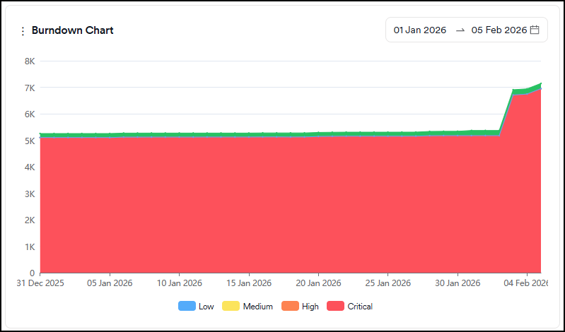
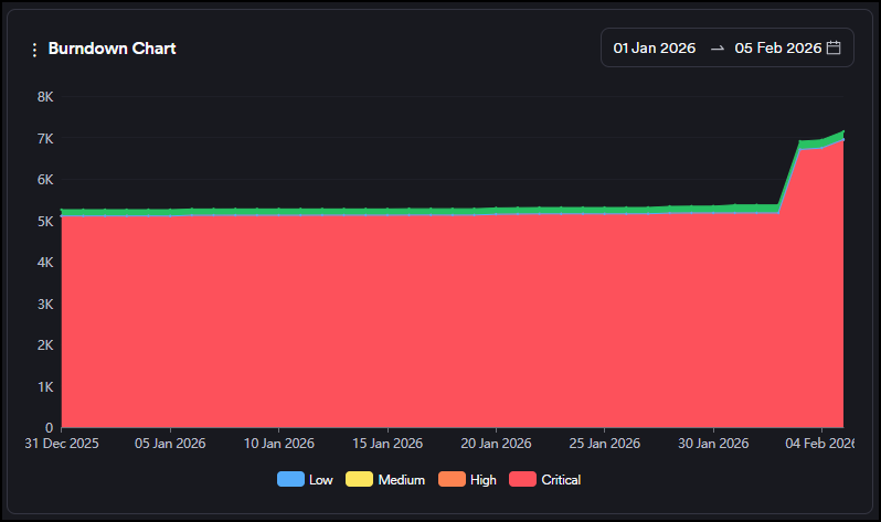
Burndown Chart
This graph shows the evolution of the sum of open and closed vulnerabilities (green area) against open vulnerabilities (red area). Open vulnerabilities contain all new and recurrent vulnerabilities.
Severity categories can be filtered by clicking the severity legend at the bottom.
Closed Vulnerabilities
This is a comparison graph where you can compare projects, products, business units or teams against each other within the selected period. Only a period within the last 90 days can be selected.
The graph shows the number of closed vulnerabilities as an increase on the y-axis.
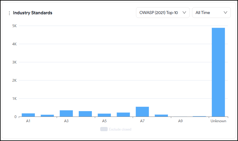
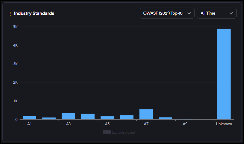
Industry Standards
This graph displays the distribution of all vulnerabilities based on OWASP Top 10, PCI, and NIST categories.
Closed vulnerabilities can be included or excluded by clicking on the legend at the bottom.
You can also filter vulnerabilities by their first-seen dates for new vulnerabilities and by their last-seen dates for closed and recurrent vulnerabilities using the time selector in the upper right corner.
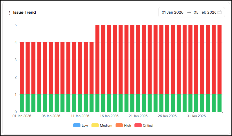
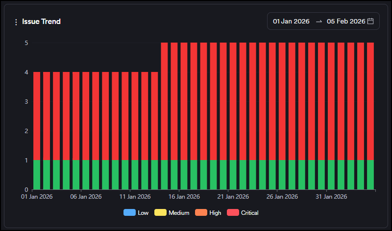
Issue Trend
This graph shows the evolution of the status (open, in progress, closed) of tickets created on the issue tracker over time.
Severity categories can be filtered by clicking the severity legend at the bottom.
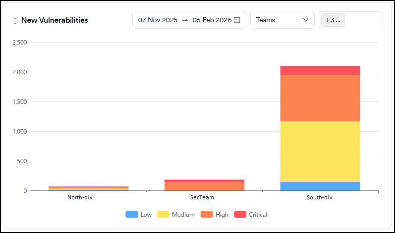
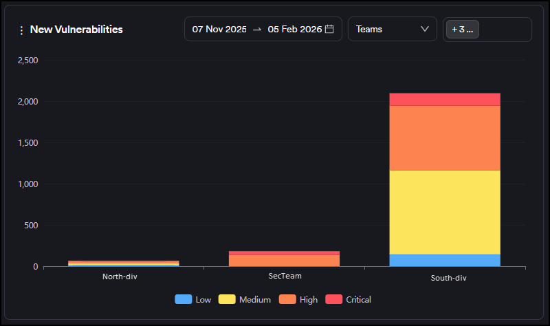
New Vulnerabilities
This is a comparison graph where you can compare projects, products, business units or teams against each other within the selected period. Only a period within the last 90 days can be selected.
The graph shows new vulnerabilities discovered for the first time as an increase on the y-axis, and closed vulnerabilities as a decrease on the y-axis. You can track whether there are more new or closed vulnerabilities within the selected period.
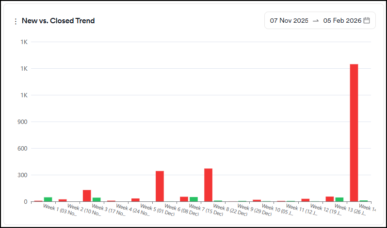
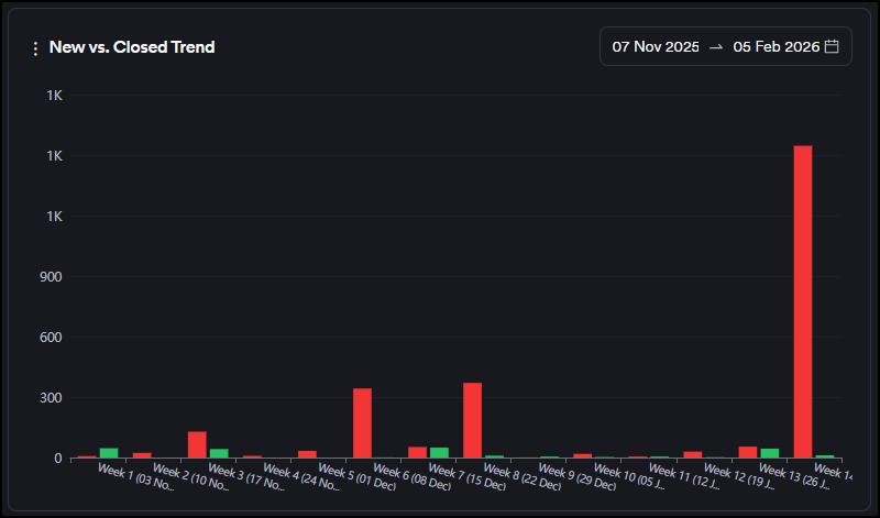
New vs. Closed Trend
This graph shows the number of vulnerabilities discovered for the first time (new) and those that have been closed within the selected period. Only a period within the last 90 days can be selected.
Weeks are treated as calendar weeks (Mon-Sunday) based on the dates selected.
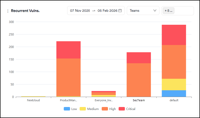
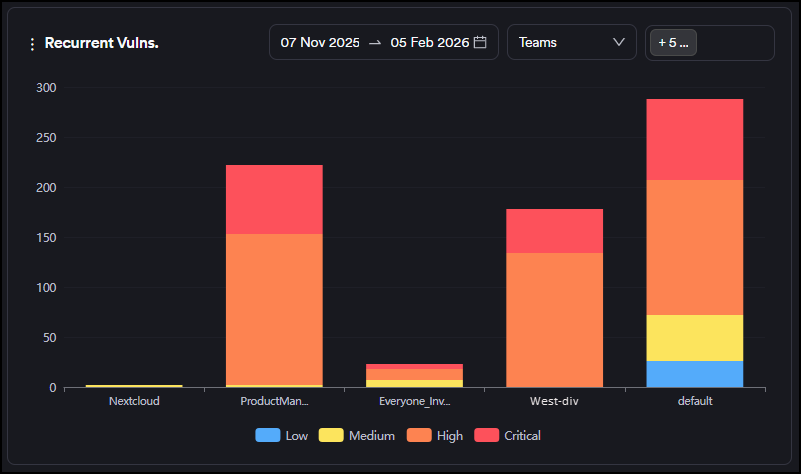
Recurrent Vulnerabilities
This is a comparison graph where you can compare projects, products, business units or teams against each other within the selected period. Only a period within the last 90 days can be selected.
The graph shows the number of recurrent vulnerabilities (discovered for the second time or more) as an increase on the y-axis.
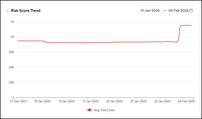
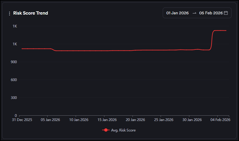
Risk Score Trend
This graph displays the evolution of the average risk score over time.
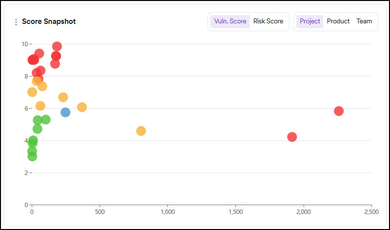
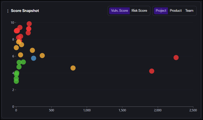
Score Snapshot
This graph can be viewed by vulnerability or risk score.
This graph shows the risk/vulnerability score (Y-axis) and the number of vulnerabilities (X-axis) of each project/team based on the risk score calculated by the number of new and recurrent vulnerabilities.
Green, yellow, and red circles indicate projects or teams depending on the tab selection within the graph.
The projects/teams performing better than average display as green circles, those performing slightly worse as yellow, and those performing dramatically worse as red.
The blue circle indicates the intersection point of the average risk/vulnerability score and the average findings.
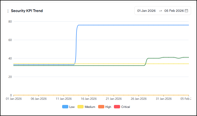
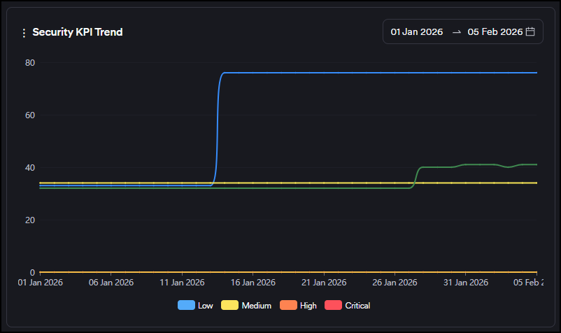
Security KPI
This graph displays the following metrics:
- Time to first response: Shows how long it takes the security team to triage a vulnerability on average (Issue Opening Date or (FP or Won't Fix Selection Date)-First Seen Date)
- Time to first action: Shows how long the development team takes to start working on a vulnerability on average (Work in Progress Date-Issue Opening Date)
- Time to resolution: Shows the average time the development team spends on a vulnerability (Issue Closing Date-Issue Opening Date)
- Time to remediate: Shows how long it takes to close vulnerabilities on average (Last Seen Date-First Seen Date)
- Go-live delay: Shows how long it takes vulnerabilities to disappear after the issues are closed on issue trackers on average (Last Seen Date - Issue Closing Date)
Severity categories can be filtered by clicking the severity legend at the bottom.
Only vulnerabilities having at least one of the dates used in each metric (time to resolution, time to response etc.) within the last 90 days are taken into account on the Security KPI chart.
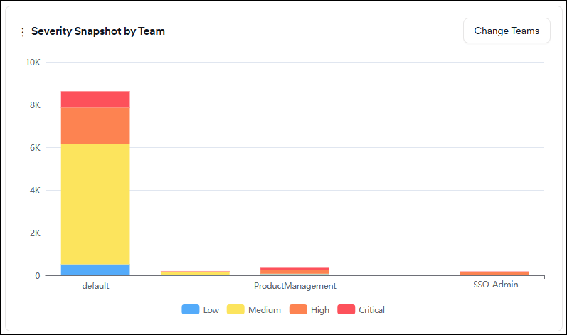
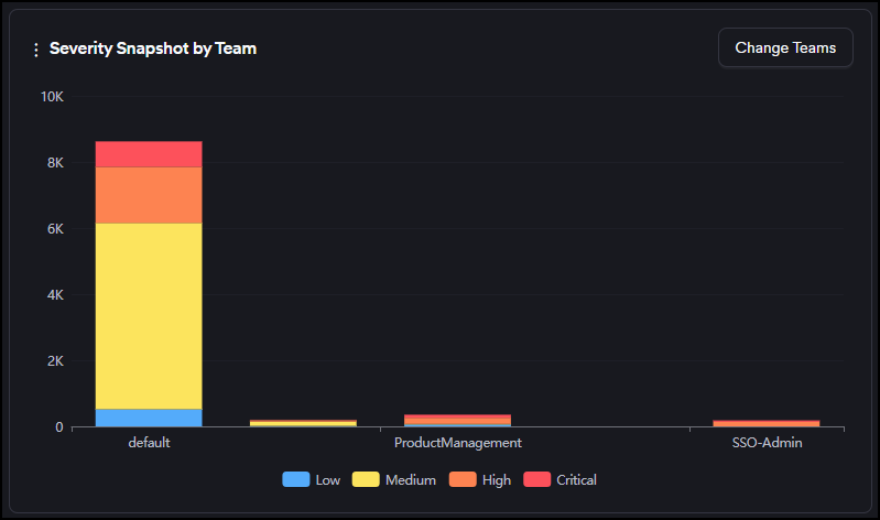
Severity Snapshot by Team
This graph shows the number of new and recurrent vulnerabilities in projects assigned to selected teams.
Severity categories can be filtered by clicking the severity legend at the bottom.
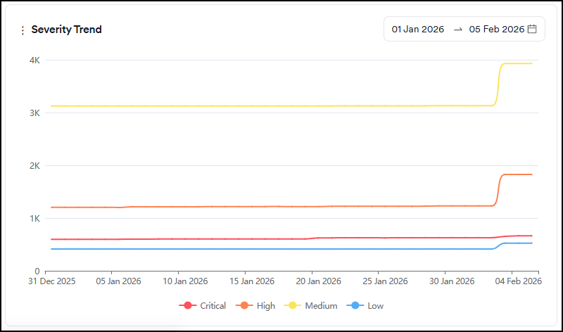
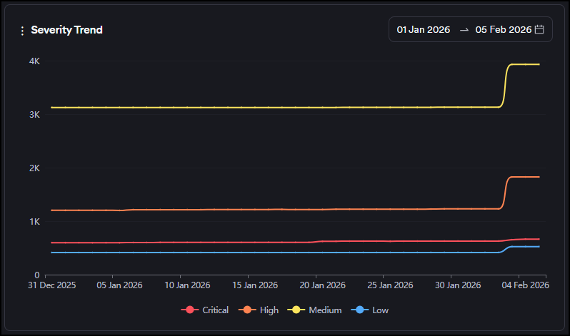
Severity Trend
This graph shows the evolution of the total number of findings that are new and recurrent under each severity category over time.
Severity categories can be filtered by clicking the severity legend at the bottom.
Suppressed vulnerabilities expiring in a week
This graph shows the number of vulnerabilities marked as false-positive, won't fix or mitigated with an expiration date in the next seven days.
Severity categories can be filtered by clicking the severity legend at the bottom.
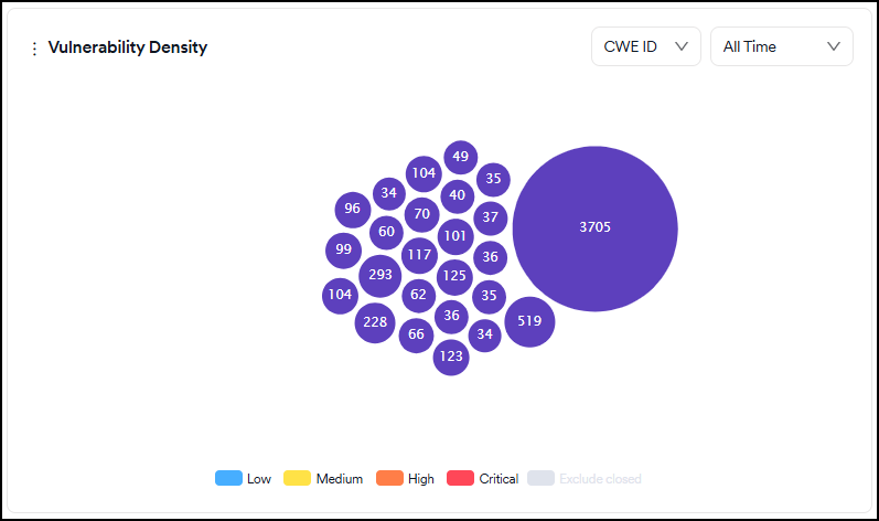
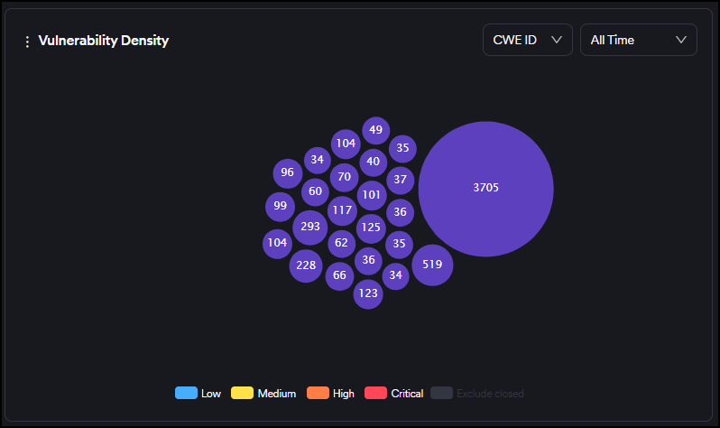
Vulnerability density
This graph shows the frequency of the top 25 vulnerabilities discovered regardless of their status (for exmple new, recurrent, closed).
Severity categories can be filtered by clicking the severity legend at the bottom.
You can also filter vulnerabilities by their first-seen dates for new vulnerabilities and by their last-seen dates for closed and recurrent vulnerabilities using the time selector in the upper right corner.
You can view the chart based on CWE ID, endpoints, or file/paths by selecting from the dropdown at the top.
The bigger the circle of a vulnerability is, the more times it has been discovered by scanners. The numbers on the other ones indicate the number of vulnerabilities falling under the same CWE ID, the endpoint, or the file/path.
Upon hovering over the vulnerability, details of the vulnerability are shown, and clicking on the vulnerability redirects you to the vulnerabilities page, where vulnerabilities with that specific CWE ID, the endpoint, or file/path are filtered.
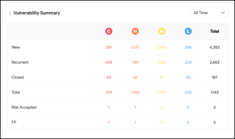
Vulnerability summary
The table in this section shows the overall situation of all vulnerabilities. It's updated as new scans are completed, files are imported, or vulnerabilities are marked as false positives or won't fix.
The time filter on the table works as follows:
- New: The filter checks the number of vulnerabilities with a first-seen date between now and the date selected
- Recurrent: The filter checks the number of vulnerabilities with the last recurrent date between now and the date selected
- Closed: The filter checks the number of vulnerabilities with a last seen date between now and the date selected
- False-positive and risk accepted: The filter checks for the number of vulnerabilities with a FP/RA Mark Date between now and the date selected
The explanations of the fields in the table are as follows:
- New: Vulnerabilities discovered for the first time in a scan. Vulnerabilities closed and rediscovered aren't classified as new but recurrent.
- Recurrent: Vulnerabilities discovered at least in two or more consecutive scans. Vulnerabilities that have been closed and then rediscovered are also classified as recurrent.
- Closed: Vulnerabilities that have been discovered in a scan and disappeared in the subsequent scans. If an issue tracker is used, even if a vulnerability is marked as closed on the issue tracker, Invicti AppSec treats it as an existing vulnerability until it disappears in a subsequent scan.
- Risk Accepted: Risk accepted vulnerabilities consist of vulnerabilities marked as either "Won't Fix" or "Mitigated." Vulnerabilities that aren't false positives but won't be fixed by the organization can be marked as Won't Fix. Vulnerabilities that already have some kind of mitigation control in place can be marked as "Mitigated." These vulnerabilities are instantly excluded from all charts and metrics.
- False Positive: Vulnerabilities discovered in a scan but marked as "false positive" by the user or the scanner. These vulnerabilities are instantly excluded from all charts and metrics.
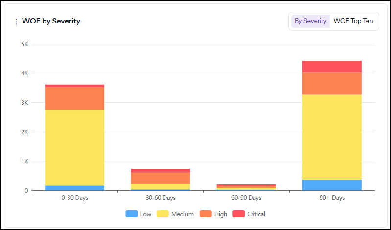
WOE By Severity
This graph displays the distribution of new and recurrent vulnerabilities based on their aging and severity categories.
In the tab at the top right corner, you can switch to the WOE Top Ten tab to see ten vulnerabilities with the highest Window of Exposure.
Severity categories can be filtered by clicking the severity legend at the bottom.
Related topics
- Dashboard overview - Understand dashboard interface, filtering, and card descriptions
- Dashboard cards description - Detailed explanations of each dashboard card
Need help?
Invicti Support team is ready to provide you with technical help. Go to Help Center